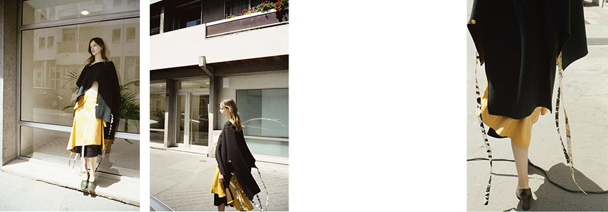
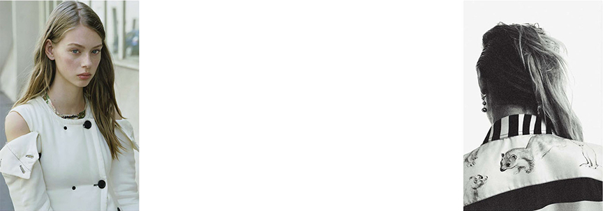
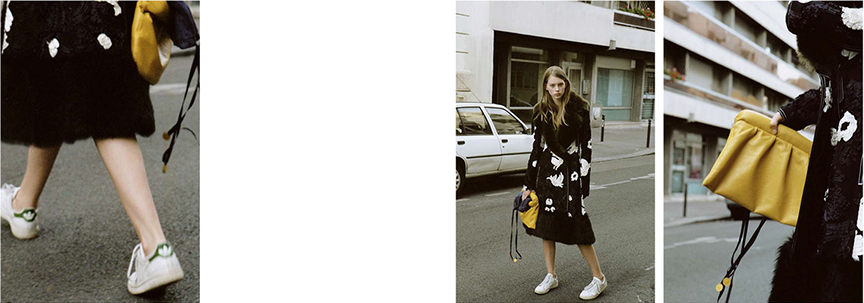
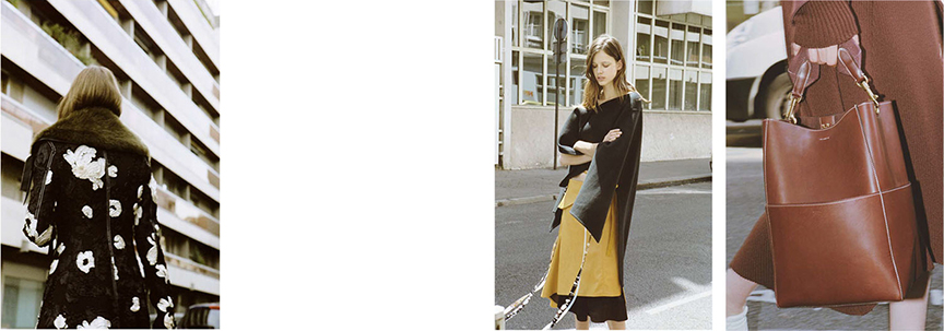
I’ve spent years editing my wardrobe and as a result, many of the bright colors and printed pieces have been donated or sold in favor of solid neutrals that are more timeless. Every year I get an itch to invest in a little color, but my only criteria is that the color must act as a neutral in the way that it still coordinates with the rest of my wardrobe. This editorial is a great example of how the idea of ‘Colors as Neutrals’ can work successfully. Stylist Elodie David Touboul effortlessly pairs soft yellow and terra-cotta with a base wardrobe of black and white. The simplicity of a single color, livens up any look when paired with neutral essentials. This editorial is two years old, but the mix of colors still feels fresh, which is essentially the ultimate goal. Do you wear a color that you consider a neutral? Leave your thoughts in the comments.


Sorry, the comment form is closed at this time.